Tables
The table module allows you to create richly formatted HTML tables on your website using a straightforward interface that includes a variety of features and controls. Tables are a great way to show information that would otherwise be challenging to present clearly, but they can be somewhat unwieldy at smaller screen sizes. For this reason, we recommend that you use a table only when you need one, and that you include in it only as much content as is necessary. You can add a new table to a page using the green add button, just as you would any other module.
The Basics
A newly-created table includes two columns and two rows. You can add content to the table directly by clicking on a cell and typing. Clicking on a cell once will highlight the cell text, and clicking on it second time will place your editing cursor inside the cell text. The current cell appears with a blue outline, and the cell that your cursor is hovering on appears with a green outline.
While working within a cell, you can use keyboard shortcuts to make text bold (Ctrl/Cmd + B) or italic (Ctrl/Cmd + I), and you can also use the tab key to move to the next cell. If at the end of a row, the tab key will take you to the first cell in the next row, creating a new row if there isn't one. You can move from cell to cell quickly, in any direction you wish, using Ctrl/Cmd + arrow keys (depending on OS and application settings, you may find that the Cmd/Ctrl + arrow keys are bound to other functions, and may have to experiment to find key the combinations that work for you).
Don't Forget to Save!
We know that the table module's editable preview looks like the real deal, but don't be fooled! Until you save your changes, they won't appear on your website and they won't be stored on the server. This means that if you navigate to another page, they'll be lost. We recommend saving periodically while working on a table to minimize the risk of losing your work.
The Toolbar
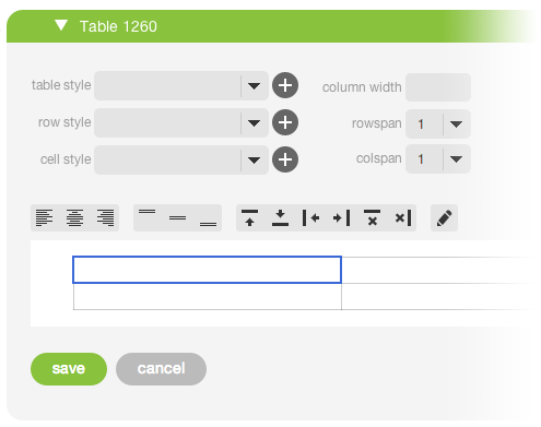
The toolbar, which sits directly above the editable table, allows you to control cell formatting, edit the structure of the table, and access the advanced cell editor.
- The first two sets of buttons in the toolbar (Fig A: a–f) allow you to control the horizontal and vertical alignment of text. Horizontal alignment applies to the current cell only, while vertical alignment applies to all the cells in the same row as the current cell.
- You can add and remove columns and rows using the third set of buttons in the toolbar (Fig A: g–l).
- The last button in the toolbar (Fig A: m) opens the advanced cell editor.
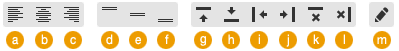
Fig A: The table module toolbar.
- Left align the current cell's text.
- Center the current cell's text.
- Right align the current cell's text.
- Top align the content in the current row.
- Middle align the content in the current row.
- Bottom align the content in the current row.
- Add a row above the current row.
- Add a row below the current row.
- Add a column to the left of the current column.
- Add a column to the right of the current column.
- Delete the current row.
- Delete the current column.
- Opens the advanced cell editor.
The Advanced Cell Editor
The advanced editor gives you access to rich formatting options, a link wizard, and an image field, which you can use to edit the contents of a cell. You can open the advanced editor for the current cell by clicking the rightmost button in the toolbar (Fig A: m), which is labeled with a pencil icon. While open, the advanced editor occupies the entire table module card, helping you to focus on the cell that you're working on. When you're finished, click the green "done" button in the lower-left corner of the module card. You'll be returned to the table editor and will see your changes to the cell in context of the table. Note that, at this point, you must still click "save" to store the changes that you made to the cell using the advanced editor.
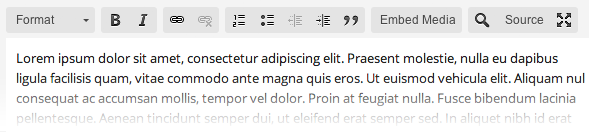
The advanced editor should be pretty familiar to you already—it's just a section without the heading fields. That means you can use all the features that you're used to from the section's WYSIWYG editor, including the link wizard and source view. To create a heading, put the text that you want to use as a heading on its own line, highlight it with your cursor, and select a heading from the formatting selector (the leftmost item in the WYSIWYG toolbar).
The advanced editor also includes the section's image box. Use it to add an image to a cell just as you would add one to a section. You can also add a link to your image using the link button next to the image box.
Unlike an image in a section, however, an image in a table cell cannot be positioned or sized with respect to the other content in the cell. The table will attempt to size columns and images automatically to accomodate large images, finding an average width that fits the table, whereas small images will be shown at their natural size. Text always appears beneath the image in a cell.
Table, Row, & Cell Styles
Above the toolbar and to the left are (at least) three selection boxes that you can use to apply styles to your table, to the current row, or to the current cell. When you select a style, you'll see it applied immediately to your table below. You can add or delete styles using the plus and minus buttons, allowing you to apply multiple styles at a time.
A set of styles come predefined. Predefined table styles allow you to remove borders, show only horizontal or only vertical borders, and apply a shaded background to every other row or column. Heading and subheading styles are available for rows. For cells, a shaded background style is available along with the "No Padding" style, which removes the space between the edge of a cell and its content—good for a cell with an image in it. Predefined styles can be edited in the "custom styles" stylesheet.
New styles can be added by navigating, from the primary nav, to design > table styles. After being added, styles are defined in the "custom styles" stylesheet.
| Heading | ||||
| Lorem Ipsum | Dolor | Consectetur | Lorem ipsum dolor sit amet, consectetur adipiscing elit. | |
| Lorem Ipsum | Dolor | Consectetur | Lorem ipsum dolor sit amet, consectetur adipiscing elit. | Link |
| Lorem Ipsum | Dolor | Consectetur | Lorem ipsum dolor sit amet, consectetur adipiscing elit. | Link |
| Lorem Ipsum | Dolor | Consectetur | Lorem ipsum dolor sit amet, consectetur adipiscing elit. | Link |
Column Width
The column width field allows you to set the width of the current column in a length unit such as pixels, ems, or percentages. Examples of values in the column width field are 100px and 20%.
Because AR5 sites are responsive, we highly reccomned using percentages to set column widths. Percentages refer to the whole width of the table. If a column's width is not specified, the content in the column will determine its width.
Rowspan & Colspan
Below the column width field are selection boxes that allow you to span a cell across multiple rows and/or columns.
The colspan field allows you to span the current cell across any number of columns to the cell's right, and the rowspan field allows you to span the current cell across any number of rows below the cell. Both of these fields are 1 by default.
When you span a cell across rows and/or columns, the content in the cells that the spanned cell covers is not deleted, but merely hidden. You can access it by setting the rowspan and colspan of the spanned cell back to 1.
See the 4x4 table below. The cell at row 1, column 1 has a rowspan of 3 and a colspan of 2.
cell 1,1 | cell 1,3 | cell 1,4 | |
| cell 2,3 | cell 2,4 | ||
| cell 3,3 | cell 3,4 | ||
| cell 4,1 | cell 4,2 | cell 4,3 | cell 4,4 |
Release Notes
Release Notes
5.1.0.5
5.1.0.5
AR5 Users,
The latest update to AR5 is now here, bringing with it a number of improvements to our suite of tools for front-end design. Themes have been expanded to include more types of page content, and you can now create and define custom module styles that you can apply, on the fly, to modules on the page. Let's take a closer look.
Video Tutorials
These short video tutorials provide an introduction to Agency of Record.