logo

Details View

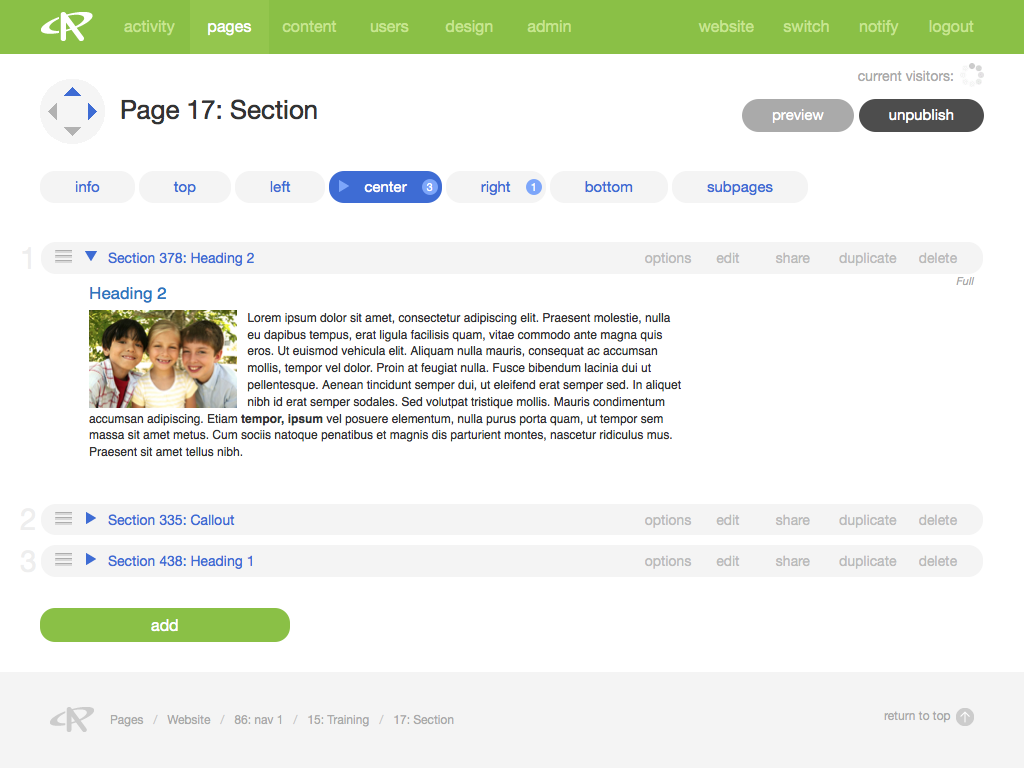
Details view is how you engage with your content for management and editing purposes. In details view you can put text on pages, store records in form modules, add images to galleries, and much more.

Clicking on a CMS link to one of your pages (e.g., "Page 215: Contact Us") or modules (e.g., "Gallery 312: Homepage Slider") from anywhere within the CMS will bring you to a details view of the page or module in question. 

Instances of details pages are in some ways as diverse as the types of content on your website, but there are some common features that appear in details view throughout AR5.

Tabs and Cards

The most essential feature of details view is organization by tabs and cards. Click among tabs to engage with different parts of the object you are viewing. 

Under each tab you may find one or more cards. Each card, in turn, contains a unit of content or a set of related information, and consists of a title bar and a body.

Note: Some tabs on details pages, such as the "records" tab on a form's details page, contain tables rather than cards.

When a tab contains multiple cards, there is often a number on the tab indicating how many cards it contains, and the cards themselves are often collapsible and/or sortable.

Click the blue disclosure arrow on the title bar of a card to open and close the card body, or the blue disclosure arrow on a tab to open and close all of the cards in that tab.

Figure A: The Card Title Bar

The Card Title Bar

Depending on the type of card, you will see one or more of the following in the title bar (Figure A):

  1. sort position - a number indicating a card’s position within an ordered list
  2. draggable handle - an icon indicating that the card can be dragged and dropped to a new position
  3. disclosure arrow - opens and closes the card body
  4. title - a name or other identifier for the card
  5. actions - a series of links for interacting with the card
  6. flags - various status indicators for the card

The Card Body

If a card contains a unit of content that is visible on your website, such as a Section module card, then the body of the card defaults to preview mode, which is an approximate representation of how your content will look on the front end. In other cases the card body will appear in info mode, containing a simple table with details of the the card’s current content. Some cards have no body at all, such as the cards under the Subpages tab in details view for a page.

If a card supports editing in place, then clicking the “edit” link in the actions area of the title bar will cause the card to enter edit mode. The title bar will change from gray to green, and the card body will be filled with editable fields. Clicking the “save” or “cancel” buttons at the bottom of the card body will return the card to preview or info mode.

Where context does not cause confusion with front-end pages, CMS pages in details view will be called details pages, (e.g., "Form 231's details page" or "a details page of a gallery").

Release Notes

Release Notes

5.1.0.5

5.1.0.5

3/6/2015 12:00:00 AM EST
9 years ago

AR5 Users,

The latest update to AR5 is now here, bringing with it a number of improvements to our suite of tools for front-end design. Themes have been expanded to include more types of page content, and you can now create and define custom module styles that you can apply, on the fly, to modules on the page. Let's take a closer look.

Video Tutorials

These short video tutorials provide an introduction to Agency of Record.