logo

Section Layout

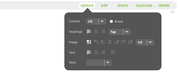
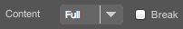
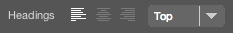
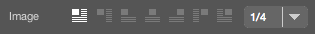
Adding content to a section is only part of the story. You can also determine how the elements of your content are arranged relative to one another within the section, as well as how the section as a whole is positioned among other modules on the page.

These layout controls can be found on the options panel of the module card. Here we will assume that you have already created a section, added content to it, and assigned it to a page. Many of the options discussed here also apply to other types of module assignments.

The Options Panel

Clicking the options link in the actions area of the section card's title bar opens the options panel.

On the options panel you’ll find several rows, each with one or more controls. As you use the controls to specify layout options, the preview area of the card will reload to reflect your changes, and the changes will be saved automatically. You can see your new layout in context at any time by clicking the Preview button at the top of the CMS page.

Please note that because the particular set of rows and controls that you find on the options panel depends on where you are working within the AR5 CMS and on how your particular CMS has been configured, you may not always see all of the options discussed here.

The Content row contains a selector for specifying the width of your section as a fraction of the page column in which it sits (see the article on page layout for more information). The options for section width are expressed as multiples of 1/12, reflecting the idea that each column of an AR5 page can be thought of as a mini 12-column grid of its own.

Next to the width selector is a Break checkbox, which you can check to force a line break after the section. If you uncheck this box and specify a width other than “Full,” the next module within the column will float to the right of the section—provided there is enough room for it—rather than stacking beneath it.

The Headings row allows you to position your headings with respect to other content within your section. Multiple heading levels within a single section are treated as a single block for layout purposes. The first three icons in the Headings row specify the justification (left, center, right) of the headings within the heading block. The selector to the right of the icons determines the position of the headings with respect to the section image.  You can place your headings in line with the “Top” or “Bottom” of your image or you can place them “Above” or “Below” it. Note that if you choose one of the “no wrap” options for image position (see below), then the “Top” option is equivalent to “Above,” and “Bottom” is the same as “Below.”

The icons in the Image row determine the position of your image relative to the text in your section, as follows:

  • “left wrap” - The image appears on the left, and any text that extends below the image wraps beneath it.
  • “left hang” - The image appears on the left, and all text hangs entirely to the right of the picture in columnar fashion.
  • “left no wrap” - The image appears flush left within the section, and the text appears entirely below the image.
  • “center no wrap” - The image is centered within the section and the text appears below.
  • “right no wrap” - The image appears flush right within the section, and the text appears entirely below the image.
  • “right hang” - The image appears on the right, and all text hangs entirely to the left of the picture in columnar fashion.
  • “right wrap” - The image appears on the right, and any text that extends below the image wraps beneath it.


To the right of the icons is a selector for specifying the width of the image relative to the width of the section. For example, if the content width is set to 1/2, and the image width is set to 2/3, the image will take up 2/3 of the module’s width and 1/3 of the total width of the column. You may also see an option for “Raw,” which indicates that the image should be rendered at its native size. This is especially useful for small images such as icons or logos. If the original image in your Library is 60 pixels wide, choosing the “Raw” options ensures that it always appears at that size regardless of how the rest of the page scales.

The icons in the Text row determine the alignment of the text content within the section: flush left, centered, flush right, or fully justified. 

The Style row contains a selector that allows you to apply a predefined style to the entire section. For example, you may have a style that decorates the section with a border and a background color, or you may have one that sets the entire section off in the style of a pull quote. You can define as many styles as you wish, and the effect of a style selection can range from simple text treatments to sophisticated behaviors involving advanced CSS and JavaScript.

Release Notes

Release Notes

5.1.0.5

5.1.0.5

3/6/2015 12:00:00 AM EST
9 years ago

AR5 Users,

The latest update to AR5 is now here, bringing with it a number of improvements to our suite of tools for front-end design. Themes have been expanded to include more types of page content, and you can now create and define custom module styles that you can apply, on the fly, to modules on the page. Let's take a closer look.

Video Tutorials

These short video tutorials provide an introduction to Agency of Record.