Module Styles
AR5 users who want to use custom CSS or JavaScript can leverage module styles to add classes to front-end HTML. Module styles are user-defined, module-type-specific, and applied on a per-assignment basis (i.e., to a particular module on a specific page). A module style consists of a name and a class. The name is used to reference the module style wherever a module of the type in question is assigned, and the class is included in the front-end HTML of any module to which the style has been applied.
For example, I could have a module style for sections called "Blue Background" with a class s-blue-bg. If I then went to "Page 23: About Us," I could edit the options for a section on that page, e.g., "Section 151: Our Commitment," choosing the Blue Background style from the list of available section styles. The front-end HTML for the Our Commitment section would then include the class s-blue-bg, and any CSS or JavaScript that targets that class would be applied to that section.
Applying a Module Style to a Module
A module style can be applied to a module using the options panel, which can be accessed wherever a module is assigned. If at least one style is defined for a given module type, a style selector will appear in options panels on modules of that type. Some modules, such as the section, come with some styles predefined (corresponding CSS is included in the default stylesheets). Choose a style from the style selector to apply it to a module. You can apply additional styles to a single assignment using the plus button next to the style selector—style classes will be added to the front-end HTML in the order that you add them to the module assignment. Styles are applied on a per-assignment basis, meaning that a shared module doesn't carry its style settings from one assignment to another. See Screenshot 1, below.
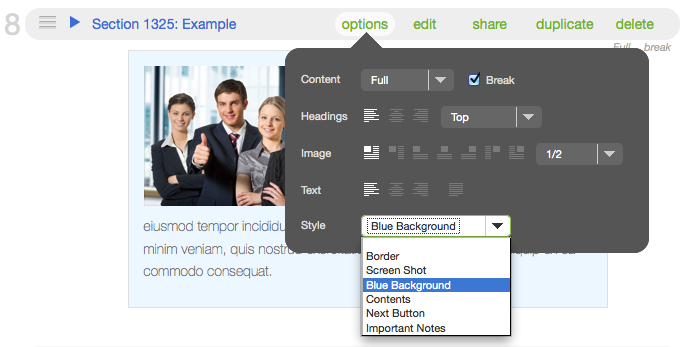
Screenshot 1: Applying a module style.
Defining a Module Style
To create a module style, choose the type of module that you would like to style (the section module is the most common), and then navigate to it from the AR5 Primary Nav: design > structures > module > [module type]. Under the styles tab, click the green add button. Add a name and a class, then click save. See Screenshots 2 & 3, below.
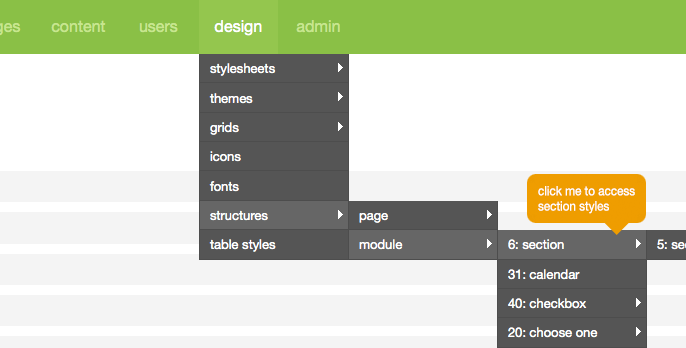
Screenshot 2: Navigating to module styles.
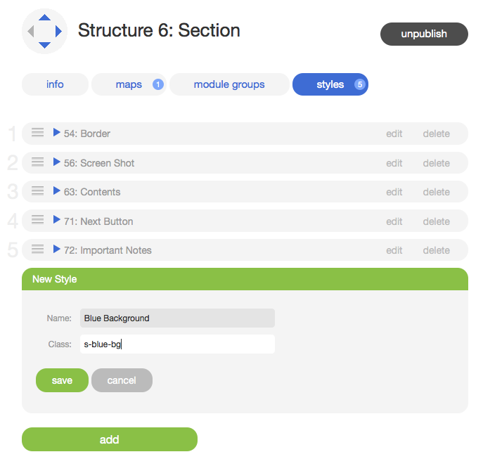
Screenshot 3: Defining a new module style.
Note
The value of the class field will be used as the class attribute of an HTML element. As such, it must conform to the following specifications:
- Begins with a letter a-z or A-Z (in HTML, all values are case-insensitive).
- Consists of the following only: letters a-z or A-Z, digits 0-9, hyphens ("-") and underscores ("_"). No spaces or special characters (DO NOT include the leading period that accompanies a class when it's used as a CSS selector, e.g., ".class-name").
Using a Module Style Class in CSS or JavaScript
See below a section with a module style, "Blue Background," applied.

This is a section module with module style "Blue Background" applied.
Lorem ipsum dolor sit amet, consectetur adipisicing elit, sed do eiusmod tempor incididunt ut labore et dolore magna aliqua. Ut enim ad minim veniam, quis nostrud exercitation ullamco laboris nisi ut aliquip ex ea commodo consequat.
Next, let's take a look at the HTML for that section. The first div contains the tile class, the tile size class (tile12), the image size class (i50), the module ID class (m1325), and the class that we're interested in, the module style class: s-blue-bg. This div—which we often refer to as the tile—is the outer-most wrapper of the front-end module. If a module has a style applied, the module style class will always appear in this wrapper, immediately following the tile class.
Finally, consider the CSS that's being used to style the section module above. Because the module style class appears in the outermost wrapper of the module's front-end HTML, it's included first in the CSS selector, and the inner wrapper or wrappers—in this case, a div identified by the class section—is specified next. In this way, you can isolate a module with a module style class and then use the AR5-generated child wrappers with their own classes to target the part(s) of the module that you want to style. CSS like this would be included in the "custom styles" stylesheet, accessible from the desgin menu. Read more about stylesheets here.
The above is just a basic example of what you can accomplish using module styles and CSS. Using more advanced CSS, you can acheive a variety of design effects, layouts, and even transitions. Using JavaScript and JQuery, you can create interactive content, show, hide, and sort content, and much more. With module styles in AR5, you can easily create, access, and apply custom classes to front-end HTML, giving you the power and flexibility to be creative.
Release Notes
Release Notes
5.1.0.5
5.1.0.5
AR5 Users,
The latest update to AR5 is now here, bringing with it a number of improvements to our suite of tools for front-end design. Themes have been expanded to include more types of page content, and you can now create and define custom module styles that you can apply, on the fly, to modules on the page. Let's take a closer look.
Video Tutorials
These short video tutorials provide an introduction to Agency of Record.