-
The Info Tab
The info tab appears on every details page in AR5. Each details page belongs to a single specific object (e.g., Form 323: Contact Us), and the info tab contains administrative details and general settings for that object. You will see the option to “delete” the object entirely, as well as often a link to “duplicate” the object, which will make a copy of the object and all its contents and then take you to the details page for that copy.
-
Preview
If the object you are viewing is a Page, a Preview button appears at the top of the details page in the CMS, next to the Publish/Unpublish button. Clicking the Preview button opens the corresponding front-end page in a separate tab or window. This works even if the page is unpublished, and you can share the resulting URL with others to allow them to view an unpublished page as well, without giving them access to the AR5 CMS.
-
Publish/Unpublish
If an object can be published and unpublished, you can find a button to do so near the upper-right hand corner of the CMS page, just under the primary navigation bar.
-
Card Titles
Most card titles can be clicked. In some contexts, clicking a title will open the card for immediate editing in place. In other cases, clicking a title will take you to the details page of the object that the card represents.
In many contexts, the color of the title varies depending on the publication status of the object. In such cases, the title text will be gray if the article is unpublished.
Most card titles are of the form: "[CMS object type] [CMS object ID]: [CMS object name]" (e.g., “Section 123: Business Hours”). If the object has an administrative name (as specified under the Info tab in the details view for that object), then the administrative name is used as the CMS object name. If the object has no name, AR5 will do its best to provide some identifying detail from the object’s content.
-
Card Actions
Exactly which action links appear in a card’s title bar varies greatly among different types of cards. Here are some of the more common actions that you will find:
- Clicking the "options" link opens a card's options panel. Most of the time, the options panel controls assignment-specific settings, i.e., how a given module (for example, "Section 121: May Getaway Details") is configured with respect to the page that it's on ("Page 234: The 2015 May Getaway"), and the other modules on that page, ("Form 179: May Getaway Registration"). Many assignment-specific options relate to layout and appearance.
- If a module is local to a page, or "unshared," it can often be edited in place by clicking the "edit" link on its card. If the module is shared, clicking the "goto" link will open a panel with links to the different tabs available on that module's details page. If a module is unshared but editing in place is not available for it (e.g., a form, a gallery), the "view" link will behave similarly to the "goto" link.
- Clicking the "share" link on a module card will allow you to name the module and make it available for addition to other pages on your site. If a shared module is only assigned to one page, you can unshare it. (Tip: to quickly change the title-bar label of a module on a page, share the module, name it, and then unshare the module—it will retain its name).
- Clicking the "duplicate" link will create a copy of the CMS object in question. A new ID will be generated for the copy, and the administrative name will read "Copy of [administrative name of original]." If the object being duplicated is duplicated from its page or module assignment (i.e., if you click "duplicate" on a module card that's sitting on a page or module's details page), assignment-specific options such as layout controls will also be copied.
- If a module is private, you can get rid of it using the "delete" button. Shared modules can only be "removed" from pages. A "removed" module no longer appears on the page or module it was removed from, but it remains available in the list of shared modules and still appears anywhere else it has been assigned. "Deleting" a module, by contrast, causes the module to be immediately and permanently deleted from the database. For this reason, you are prompted to confirm every time you are about to perform a "delete" action.
-
Add Button
If the tab you are viewing contains a list of items, and more items can be added to that list, an Add button will appear at the bottom of the content area. In some cases clicking Add creates a new object immediately and takes you to edit mode for the new object before appending it to the list. In other cases, such as when adding a module to a page, a menu appears, allowing you to further specify what is to be added.
Common Features in Details View
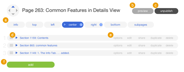
Fig A: Common features in details view.
Release Notes
Release Notes
5.1.0.5
5.1.0.5
3/6/2015 12:00:00 AM EST
11 years ago
AR5 Users,
The latest update to AR5 is now here, bringing with it a number of improvements to our suite of tools for front-end design. Themes have been expanded to include more types of page content, and you can now create and define custom module styles that you can apply, on the fly, to modules on the page. Let's take a closer look.
Video Tutorials
These short video tutorials provide an introduction to Agency of Record.