In themes, style options are grouped according to the type of element that they apply to. Under the content styles tab, these style groups can be added to page regions, and under navigation styles, they can be added to each navigation, either to the first level or to the sublevels. When a style option is left blank or there is no style group with an option assigned to a page region, the page region will attempt to inherit a value for that option (see this diagram for information on page region structure). If that option doesn't have an assigned value for any of a region's parent regions, it will use the default value. This article contains a detailed breakdown of the available style groups and the style options that they contain, including inheritance rules and default values.
Style Groups and Style Options
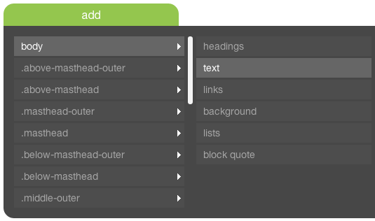
Content Styles
These are the style groups that are available to add to page regions under the content styles tab of a theme, including a brief description of each and a list of links to information about each of the individual style options available in it.
For each of four available headings, H1, H2, H3, and H4, the following style options are available:
Options in the Text group control the look and feel of text. Available options are:
The Block Quote style group allows you to control the look and feel of content that is wrapped in <blockquote> tags. You can apply blockquote tags to text in a section easily using the button on the WYSIWYG formatting pallette that's labeled with a quotation mark. The available options are:
Options in the Links group the look and feel of hyperlinks. A set of options is available for the default state of links, and a subset of those options is available for the hover state. The available options are:
The options in the Background group allow you to set a background image and/or color, and control how they appear. The available options are:
Options in the Lists group control the look of ordered and unordered lists. A set of the following style options is available for each type of list:
These are the style groups that are available to add to navs under the navigation styles tab of a theme, including a brief description of each and a list of links to information about each of the individual style options available in it.
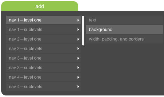
Options in the Text group control the look and feel of text. In navigation styles, the text group contains two identical sets of style options: one for the "default state" of nav items, and one for the "hover and on states" of nav items. The options in the "hover and on states" set control how text appears in a nav item when you hover on it or when you are currently on that item's page or its child page.
The options in the Background group allow you to set a background image and/or color, and control how they appear. As with text, there are two sets of background options available in nav styles—one for the default state, and one for the hover and on states. The available options are:
This style ground controls the width of each nav list item, as well as its border and the padding around the text. Available options are:
- Item Width
- Text Padding
- Border
Style Options
Below are the style options available in style groups. Below the name of each style option (which is listed as it appears while editing a style card) are four pieces of information: the name of the CSS property to which the option corresponds, whether the option inherits its value from parent page regions or parent nav levels, the default value of the option, if specified, and a link to the CSS property's entry in the Mozilla Developer Network's CSS Reference.
The default value comes from the CSS specifications, and will only be used if there is no value assigned, either directly or by inheritance, and either in the theme or in the stylesheets, to the element in question.
Also included for each option is a brief definition of the CSS property that it controls, some notes about that property's usage, its limits, and its requirements, as well as some information about how the option behaves within the themes interface.
-
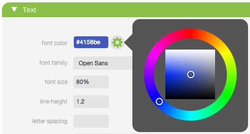
Font Color
CSS property: "color" | Inherits value: yes | Default value: not specified | Option type: text/widget | CSS Info
The foreground color of an element's text content and its decorations (underlines, overlines, and line-throughs). Clicking the cog wheel next to the color field opens the color select widget (see screenshot below). Selecting a color in the widget deposits the hex value of that color into the color field. You can also type or paste in your own value. The background of the color field serves as a preview, showing the color that's currently entered in the field.
- Font Family
CSS Property:font-family| Inherited: yes | Default: depends on browser | Option type: select | CSS Info
The font of text. Fonts in AR5 are controlled in the fonts manager. The available fonts in the theme correspond to the fonts that are defined there. - Font Size
CSS property:
font-size| Inherited: yes | Default:medium| Option type: text | CSS Info
The size of a font. A unit is required in the value for this option—acceptable units include pixels (px), ems (em), and percentages (%). We recommend that you use pixels for your body font size, and percentages for your other page regions. A percentage is interpreted as a percentage of the parent element's font size. For example, if body is set to 12px, text in a page region with font-size set to 200% (if no parent font size is set besides body), will appear as 24px, and this region's child region, if set to 100%, will also appear as 24px, because it is 100% of the size of its parent's font, which is 200% of 12px. -
Font Style
CSS property:font-style| Inherited: yes | Default:normal| Option type: select | CSS Info
Font style allows you to set the font toitalicoroblique. An italic is, traditionally, a special version of the font created by the designer in which the characters are redrawn, whereas an oblique is simply a skewed or slanted version of the regular characters. Italic is preferred. -
Font Weight
CSS property:font-weight| Inherited: yes | Default:normal| Option type: select | CSS Info
The weight or boldness of the font. Available values arenormal, bold,and100, 200, 300,etc., through900, with100being the lightest and900the heaviest weight.400is the same asnormal, and700is the same asbold. Some fonts are available only innormalandbold; for these fonts,100-500arenormal, and600-900arebold. -
Line Height
CSS property:line-height| Inherited: yes | Default:normal| Option type: text | CSS Info
The minimal height of a line element, such as a line of text. While units such as pixels and ems are allowed, as well as percentage values, the preferred way to specify line height is with a unitless number (the default for most browsers is roughly1.2). This is because of the way that line height is inherited. The value that's ultimately used by browsers is the result of a calculation involving font size and the specified line height value. If the line height value includes a unit, the result of this calculation is what's inherited by child elements, so if a child element has, for example, a much larger font size than its parent, the text in the child element will appear squeezed because the browser will be using a line height that was calculated using the parent's smaller font size. If, on the other hand, a unitless number is used, this number itself is inherited by the child element and used, along with its own font size, in the calculation. For an example of this, click here. -
Letter Spacing
CSS property:letter-spacing| Inherited: yes | Default:normal| Option type: text | CSS Info
Increases or decreases spacing between text characters. A unit of length (emorpx) is required in the value for this option—percentages and unitless numbers are not supported. Negative values are allowed, which will result in characters appearing closer together. A positive value will be added to the normal amount of space between letters. -
List Style
CSS property:list-style-type| Inherited: yes | Default:disc| Option type: select | CSS Info
Specifies the appearance of list items in ordered and unordered lists. For unordered lists, the available values aredisc(default),circle,square, andnone. For ordered lists, the available values aredecimal(default - "1, 2, 3..."),decimal-leading-zero("01, 02, 03..."),lower-alpha("a, b, c..."),upper-alpha("A, B, C..."),lower-roman("i, ii, iii, iv..."),upper-roman(I, II, III, IV...), andlower-greek("α, β, γ..."). -
List Position
CSS property:list-style-position| Inherited: yes | Default:outside| Option type: select | CSS Info
Defines the position of the list item marker with respect to the block in which the list sits. Available options areinsideandoutside. See example, with borders to illustrate the edge of the content block:
- This is a list with List Position set to "inside."
- Item 2
- Item 3
- This is a list with List Position set to "outside."
- Item 2
- Item 3
-
Text Align
CSS property:text-align| Inherited: yes | Default:left| Option type: select | CSS Info
The alignment of inline content—like text—within its parent block element. Available values areleft, right, center,andjustify. Note that alignment of text, images, and headings can be controlled using section layout. -
Text Decoration
CSS Property:text-decoration| Inherited: no | Default:none| Option type: select | CSS Info
Allows you to add anunderline,overline, orline-throughto text which, along withnone,are the available values for option.Nonecan be used to remove an existing text decoration. For example, if links are set tounderlineand you wanted to remove the underline on hover, you would set the text decoration option in the link hover state tonone. -
Text Transform
CSS Property:text-transform| Inherited: yes | Default:none| Option type: select | CSS Info
Determines if and how text is capitalized. Available options arenone,uppercase,lowercase,andcapitalize,which makes the first letter of each word uppercase. -
Margin
CSS properties:margin-top, margin-right, margin-bottom, margin-left
Inherited: no | Default value:0| Option type: text | CSS Info
Sets the margin for each of the four sides of the element individually. Length values in units such aspxandemare accepted, as are percentages. Percentages always refer to the width of the containing block, even for top and bottom margin. Negative values are allowed for both lengths and percentages.Autois also an acceptable value for the left and right margins, and is used for centering an element within a parent of a greater width (enterautoin both the left and right margin fields). See the note on box model, below. -
Padding
CSS properties:padding-top, padding-right, padding-bottom, padding-left
Inherited: no | Default value:0| Option type: text | CSS Info
Sets the padding for each of the four sides of the element individually. Length values in units such aspxandemare accepted, as are percentages. Percentages always refer to the width of the containing block, even for top and bottom padding. Negative values are not allowed. See the note on box model, below. -
Border
CSS properties:border-top, border-right, border-bottom, border-left
Inherited: no | Default value:none 0 [currentColor]| Option type: text, select, and widget | CSS Info
The border options allow you to set, for each of the four sides of an element, the values of the three properties that define a border: width, style, and color. For more information on borders, see the note on box model, below.
Theborder-widthproperty is specified in a text field. Accepted values are lengths with units such aspxorem.Also accepted are keywords:thin,medium,orthick.The precise thickness of each of these keywords is not defined in the CSS specification, and is therefore dependent on browser.Mediumis the default width if theborder-styleproperty is given a value other thannoneorhidden.
No border will appear unless theborder-styleproperty is given a value (a value other thannoneorhidden), and setting theborder-styleis all that is required to cause a border to appear. Theborder-styleproperty is specified with a select, and there are ten available values. See this resource for more information on the differentborder-stylevalues.
Theborder-colorproperty is defined using a special text field and color widget, which are the same as the ones used for the Font Color option. The defaultborder-color, if theborder-styleproperty is given a value other thannoneorhidden,is the current value of the element'scolorproperty.
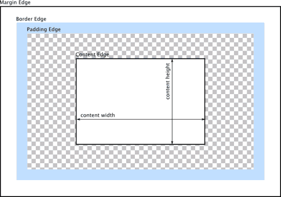
The Standard Box Model
In an HTML document (a web page), each element is represented as a rectangular box. CSS and, by extension, AR5 themes, describe these box elements for positioning and styling according to something called the standard box model. In basic terms, a box consists of content, padding, border, and margin—in that order. To be precise, we should say that each box has four edges: the content edge, the padding edge, the border edge, and the margin edge (see diagram). When the CSS property box-sizing is not set to a value other than its default, the content edge is determined by the size of the content, or by the CSS properties width, min-width, max-width, height, min-height and max-height. The padding determines the amount of space between the content edge and the padding edge. Padding is transparent. Setting the border for an element determines the space between the padding edge and the border edge, and margin controls the space between the border edge and the margin edge.
- Background Color
CSS Property:background-color| Inherited: no | Default:transparent| Option type: widget | CSS Info
The color of the background of an element. Acceptable values are CSS colors, which can be defined using the color widget (see Font Color above for more information on the color widget). The background extends to the outside edge of the padding by default. Background colors are rendered behind background images. See the note on box model above. - Background Image
CSS Property:background-image| Inherited: no | Default:none| Option type: widget | CSS Info
Sets an image to be used as the background for an element. Background images are rendered on top of background colors. The background image style option includes a box where a preview of the currently selected image is displayed. Clicking on the preview area opens a panel with URL field and a link to the library. Clicking the library link allows you to choose an image file in your library, the URL of which will be deposited into the background image field when you click on it. If a broken url is included, browsers will treat the background image property as if it were set tonone(as opposed to rendering a broken image icon). - Background Repeat
CSS Property:background-repeat| Inherited: no | Default:repeat| Option type: select | CSS Info
Determines how background images are repeated. An image can be repeated upon the horizontal or vertical axis, along both, or not repeated at all. Available values arerepeat, which is the default and repeats the image along both axes,repeat-x, which repeats the image along the horizontal axis only,repeat-y, which repeats the image along the vertical axis only, andno-repeat. Useno-repeatwhen you want an image to appear only once, as for instance when adding an icon to a list item. - Background Attachment
CSS Property:background-attachment| Inherited: no | Default:scroll| Option type: select | CSS Info
Determines how an element's background image is positioned re: scrolling. The default,scroll, means that the image will scroll with the element that it's contained in. When set tofixed, the image will remain fixed in place within the browser viewport, not scrolling with its containing element. Selectinglocalmakes the image scroll not with its containing element, but with that element's content. This is useful when you have scrolling content within the scrolling page. - Background Position
CSS Property:background-position| Inherited: no | Default:0% 0%| Option type: text and widget | CSS Info
Sets the initial position of a background image. Accepted values are position values, that is one to four values representing a 2D position in relation to the edges of the element's box (by default, this in relation to the padding edge). Keywords are available in a selection box accessible by clicking the cog wheel next to the text field. See Mozilla Developer Network's article on CSS position values. - Background Size
CSS Property:background-size| Inherited: no | Default:auto auto| Option type: text and widget | CSS Info
The size of a background image. Length values such as px and em are allowed, as are percentages. Values can be declared separately for the horizontal and vertical dimensions (eg, 50% 400px, or 50% width and 400px height), and if only one value is given, it will be used for both dimensions. Also supported are the keywords cover and contain, which can be accessed be clicking the cogwheel next to the text field. The keyword cover specifies that the background image should be scaled to the smallest possible dimensions where both dimensions are greater than or equal to the background positioning area (by default, the area inside the padding edge). The contain keyword specifies that the image should be scaled to the smallest possible dimensions where both dimensions are less than or equal to the background positioning area.
Release Notes
Release Notes
5.1.0.5
5.1.0.5
AR5 Users,
The latest update to AR5 is now here, bringing with it a number of improvements to our suite of tools for front-end design. Themes have been expanded to include more types of page content, and you can now create and define custom module styles that you can apply, on the fly, to modules on the page. Let's take a closer look.
Video Tutorials
These short video tutorials provide an introduction to Agency of Record.