Galleries
The Gallery module allows you to display multiple units of content in a single place on your page, one after the other. Sections and HTML modules are the units of content in a gallery, and you can add them to galleries in much the same way that you would add them to pages. Once you've added items to your gallery, you can control transitions, delay, and optional thumbnails and navigation, allowing you to create rich, high-quality presentations that fit your content.
Begin by adding a new gallery to a page, just as you would any other type of module (see Adding Content to a Page for more info).
Adding Items to a Gallery
To add content to a gallery, begin by navigating to the gallery's details page by clicking "view" on the title bar of the gallery's page card. A menu will open with links to the tabs that are available on the gallery's details page. Click "items."
In the items tab are the gallery's units of content, which are either Section modules or HTML modules. Add a new or shared module to the gallery using the add button at the bottom of the page. Modules that you add will appear as cards in the list of items above. Drag and drop the cards in the list to change the order in which they appear in the gallery on the front end (if playback is set to random, the order of items doesn't matter).
The gallery supports text, images, links, and video—anything that you can add to a section or HTML module can be added to a gallery. The applications are practically limitless. Here are some ideas to get you started:
- Create a gallery on your homepage that behaves just like the traditional sliders that you’re used to. Use autoplay, choose a delay between slides, and pick from a wealth of different transitions.
- Use galleries for product details pages. Include different photos of each product and display thumbnails of them at the bottom or top of your galleries so that customers can quickly find the image they’re interested in.
- Create a gallery for step-by-step instructions, using text, diagram images, and videos. Include numbered navigation bullets to make reviewing previous steps easy.
Gallery Item Presentation Options
Because the items in a gallery are the same modules that you assign to pages, the same layout options are available. Click "options" on a gallery item's card title bar to open its options panel. In the case of a gallery section, you can use the same section-specific layout controls that you use on a page to size and position your headings, text, and images (see Section Layout for more information).
Galleries are an ideal setting for leveraging section styles, which are available on a section's options panel and defined in the stylesheets. Using section styles, you can overlay text onto your images, use backgrounds, special fonts, and much more. One advantage of section styles is that you can use real text instead of static graphics—achieving the same great look without the need for Photoshop, and making your text available to search engine crawlers. Your CMS should have some section styles in it already, including the "Text Over Image" styles. Experiment with existing styles and feel free to contact us if you want to change them or add new ones.
Gallery Options
The gallery's options panel is available on the gallery card's title bar. On the options panel are layout, navigation, transition, and playback controls for the gallery. Here are the available controls, with brief descriptions of each:
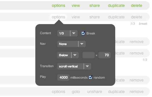
Content:
The width selector controls the width of the gallery with respect to the page column it's in. The break checkbox determines whether other modules are allowed to float next to it within that column. See Page Layout for more info.
Nav:
The first nav control is a selector for the type of navigation to include with the gallery: bullets, thumbnails, or "none." Each item in either bullet or thumbnail navigation corresponds to a gallery item, and clicking on a navigation item will cause the corresponding gallery item to be shown. Bullets appear as small squares with numbers in them, and the bullet corresponding to the item that is currently showing is highlighted. If you choose thumbnails, the gallery will use any available section image from each item as the thumbnail image. When an item contains no image, a placeholder image will be used. The placeholder image is named thumbnail.png and can be can be replaced if you choose—it's in folder /library/public/designs/default of the Library.
- Note: In addition to the optional navigation, previous and next arrows appear by default when a user hovers over the gallery with his or her cursor. The previous and next arrows are managed through the stylesheets.
The second available nav contol is a selector that determines the position of the optional navigation: either above or below the gallery body.
Next to the position selector are two fields that determine the pixel size of the thumbnails (the first field from left to right is pixel width, the second is pixel height).
Transition:
The transition you select determines the look and feel of the transition from one gallery item to another on the front end. Several different transitions are available. You can see samples of the available transitions on this page.
Play:
The first of the two available playback options determines how long the gallery waits before it transitions from one item to the next. If you enter 0 in this field, the gallery will not transition automatically from one item to the next but will allow the user to control playback manually. Checking the "random" checkbox causes the gallery items to appear in random order. If this box is not checked, items appear in the order in which you have sorted them.
- Note: Gallery playback is automatically paused when a user hovers over a gallery item with his or her cursor, and resumes when the user stops hovering. However, because embedded video players use the cursor's hover state for their own controls, the user must click on a video in a gallery to pause playback, after which he or she can access the video's controls—gallery playback will not resume until the user resumes it manually. An explanatory overlay automatically appears when a user hovers over a video in a gallery.
Advanced Configuration
On a gallery's details page, under the "gallery" tab, a text area labeled "advanced configuration" is available. In the text area you can leverage the options supported by the jQuery Cycle plugin that the AR5 Gallery module uses. Contact AR support for more information, and see this external article on the plugin's options.
Release Notes
Release Notes
5.1.0.5
5.1.0.5
AR5 Users,
The latest update to AR5 is now here, bringing with it a number of improvements to our suite of tools for front-end design. Themes have been expanded to include more types of page content, and you can now create and define custom module styles that you can apply, on the fly, to modules on the page. Let's take a closer look.
Video Tutorials
These short video tutorials provide an introduction to Agency of Record.